This project (made for course web design 1) focused on developing a dedicated web platform for "Udruga Volim gramofonske ploce Osijek" (VGP Osijek), an association dedicated to vinyl culture. Previously, the organization relied solely on Instagram for promotion, which led to information being scattered and difficult to navigate. The primary goal of this web solution was to centralize their activities ranging from vinyl fairs and all-vinyl DJ sets to educational workshops and listening sessions into a cohesive, user-friendly digital space.
SITEMAP
The strategic purpose of the website is to streamline community engagement. It provides a clear overview of upcoming events, simplifies the registration process for fair exhibitors, and creates a hub for the growing community of collectors, DJs, and young enthusiasts eager to explore vinyl culture.
Additionally, the site serves as a professional touchpoint for potential sponsors and tourists looking for cultural events in Osijek
From a UX (User Experience) perspective, the redesign addressed several pain points identified in the initial testing phase. One major issue was the lack of a "Home" link in the navigation, which left users feeling lost; I corrected this by establishing a clear, persistent navigation hierarchy. I also focused on clarifying the distinction between the "Membership" and "User Profile" sections—two areas that previously confused users. By restructuring the information architecture, I ensured that the process of joining the association and managing a personal profile is now intuitive and distinct.
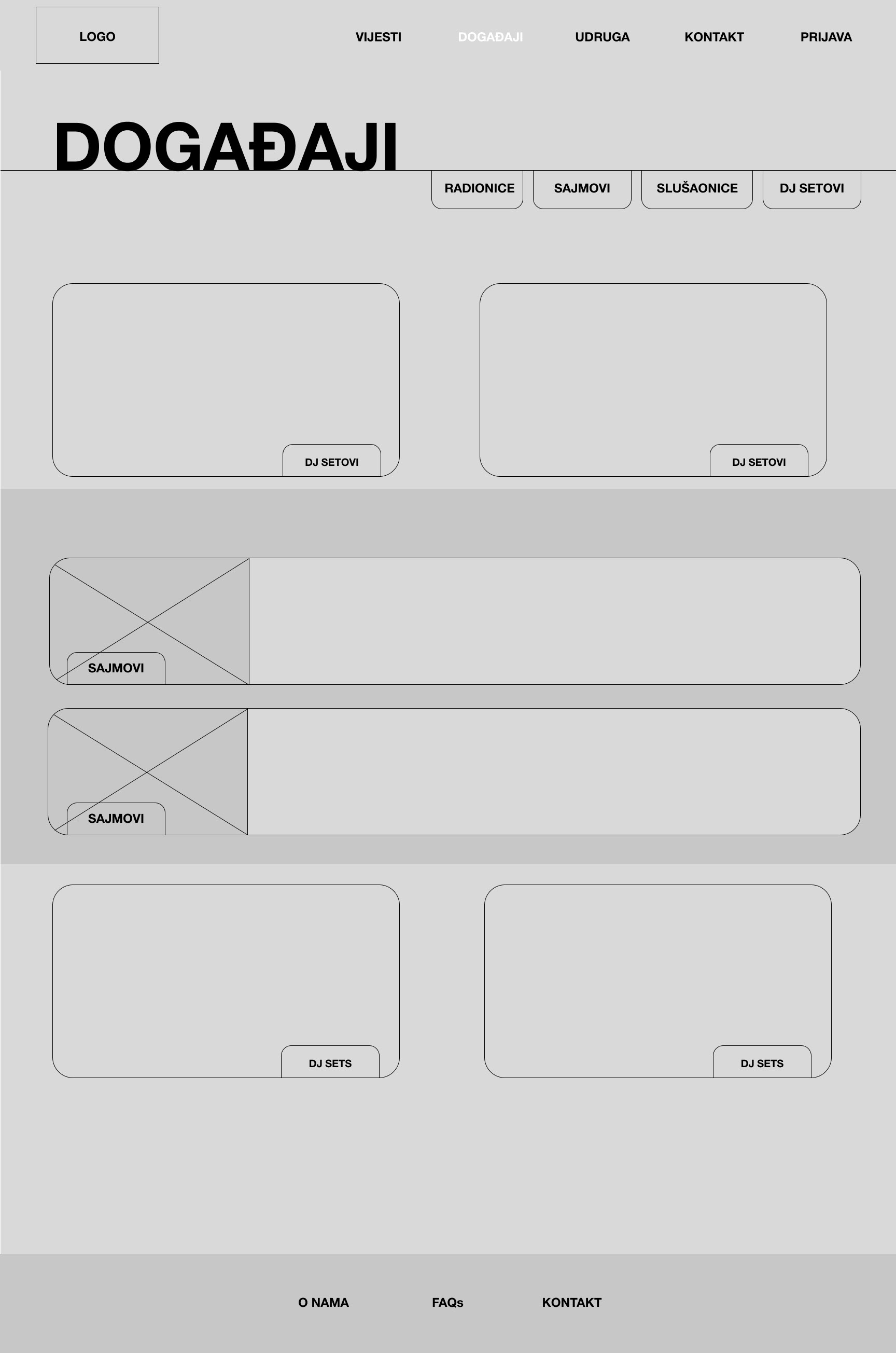
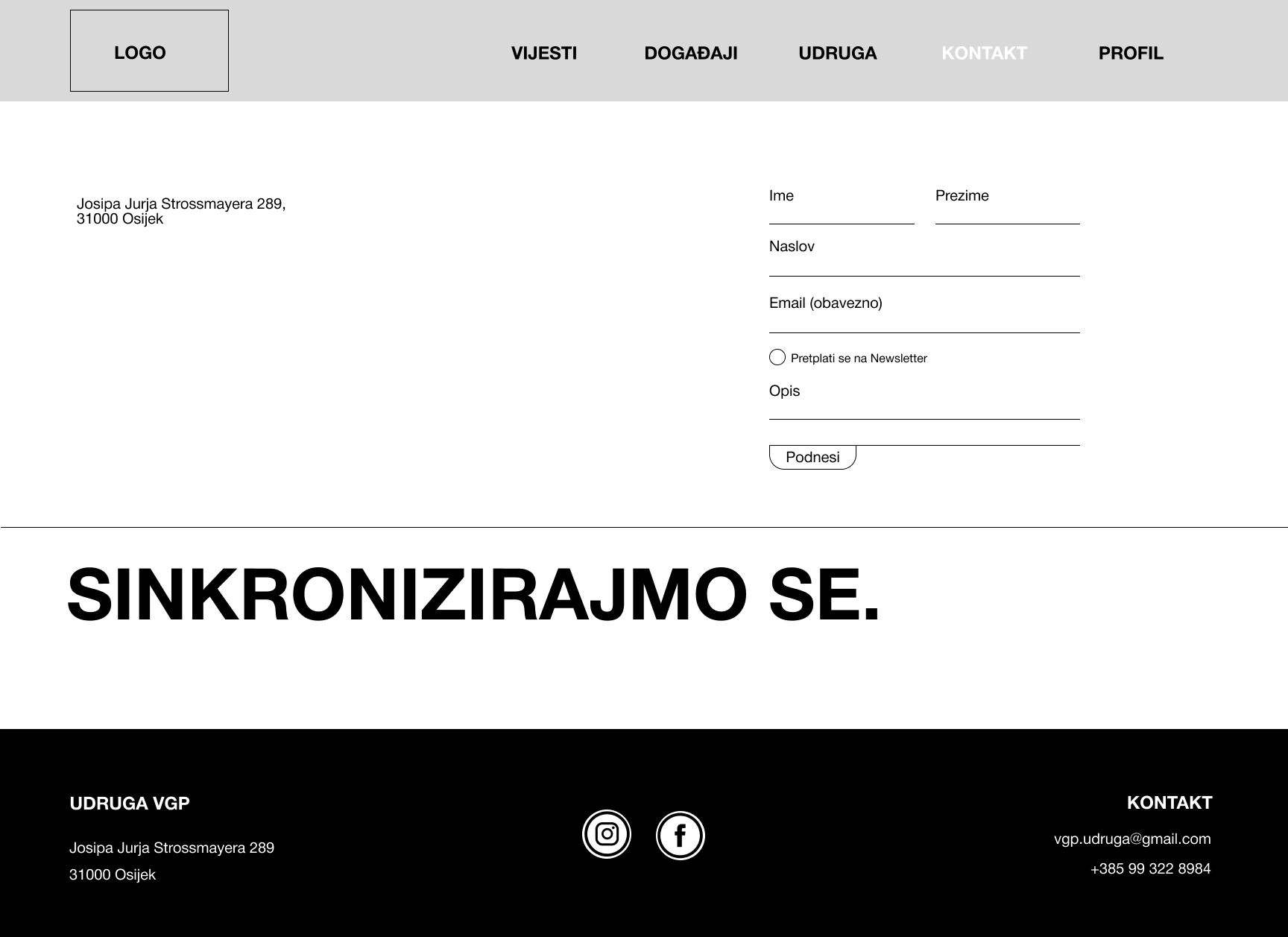
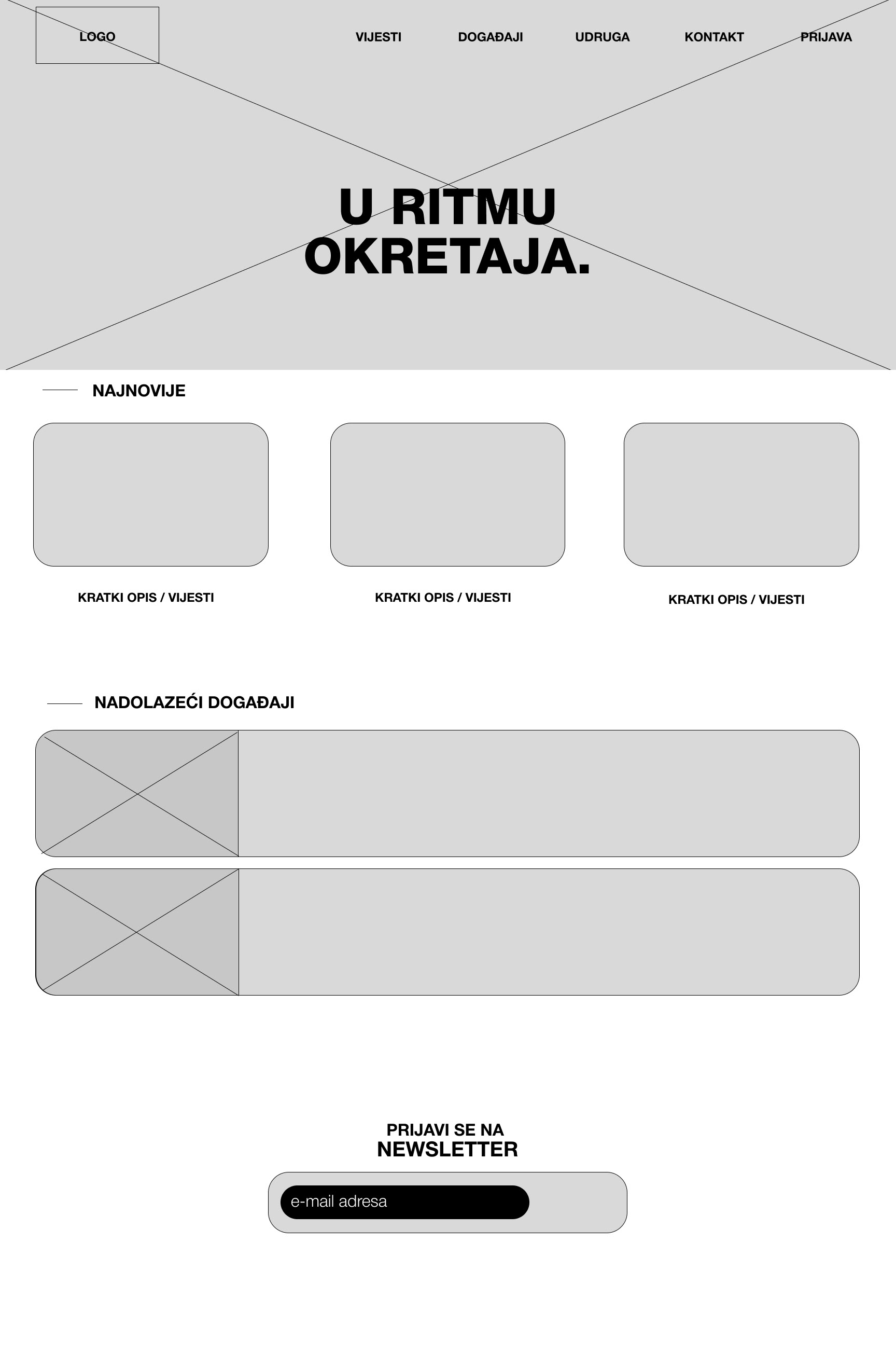
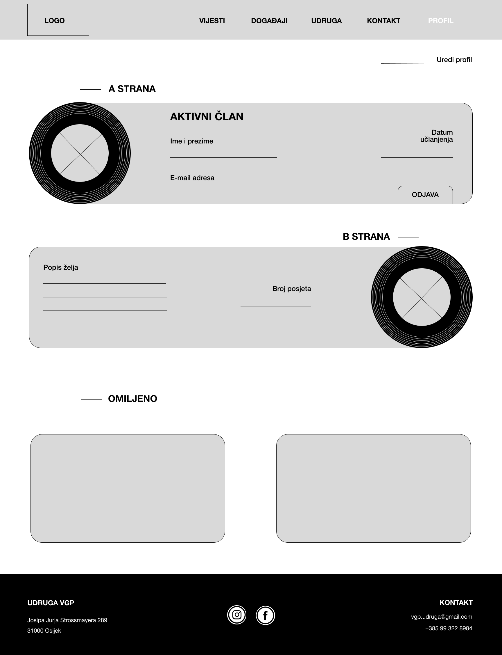
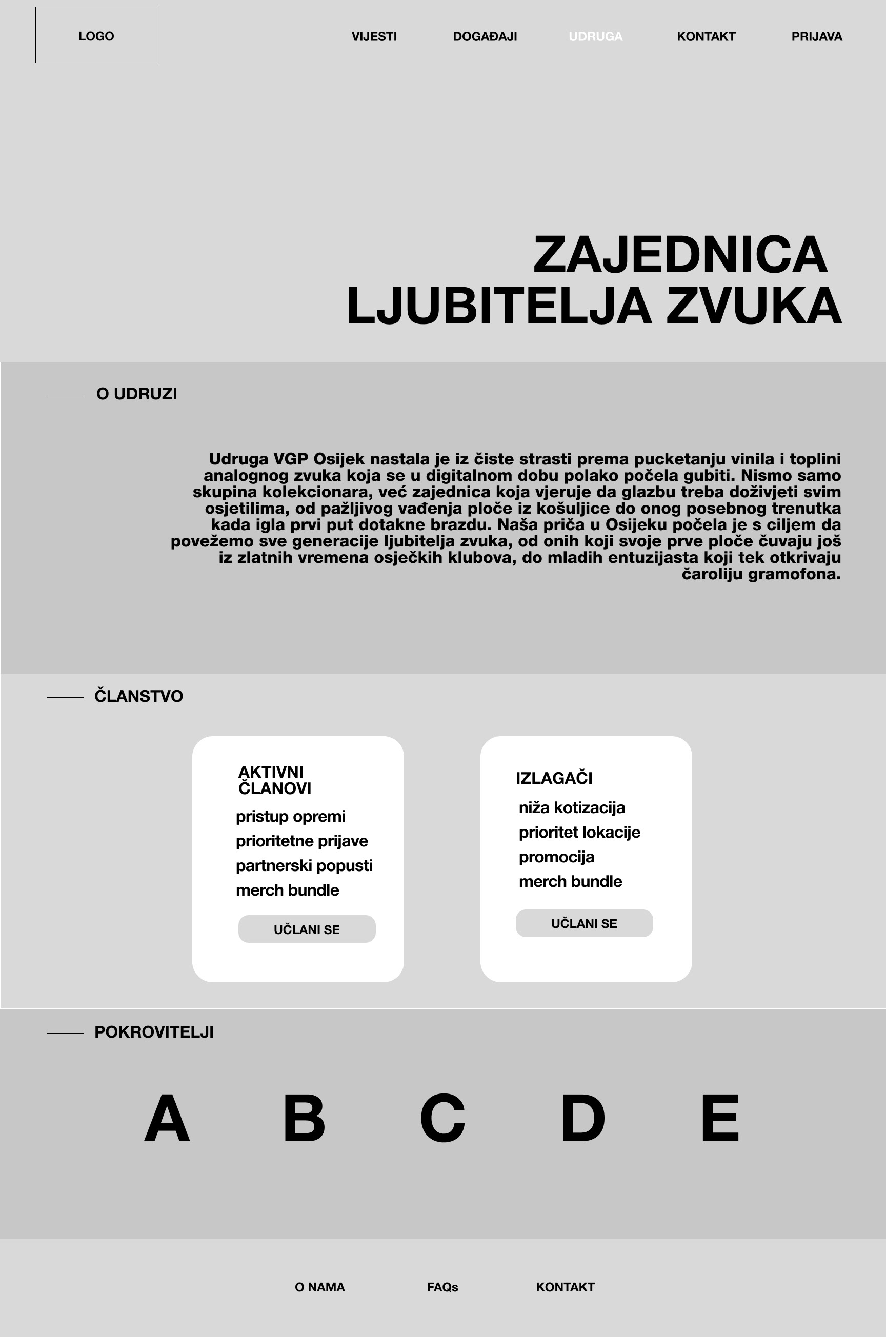
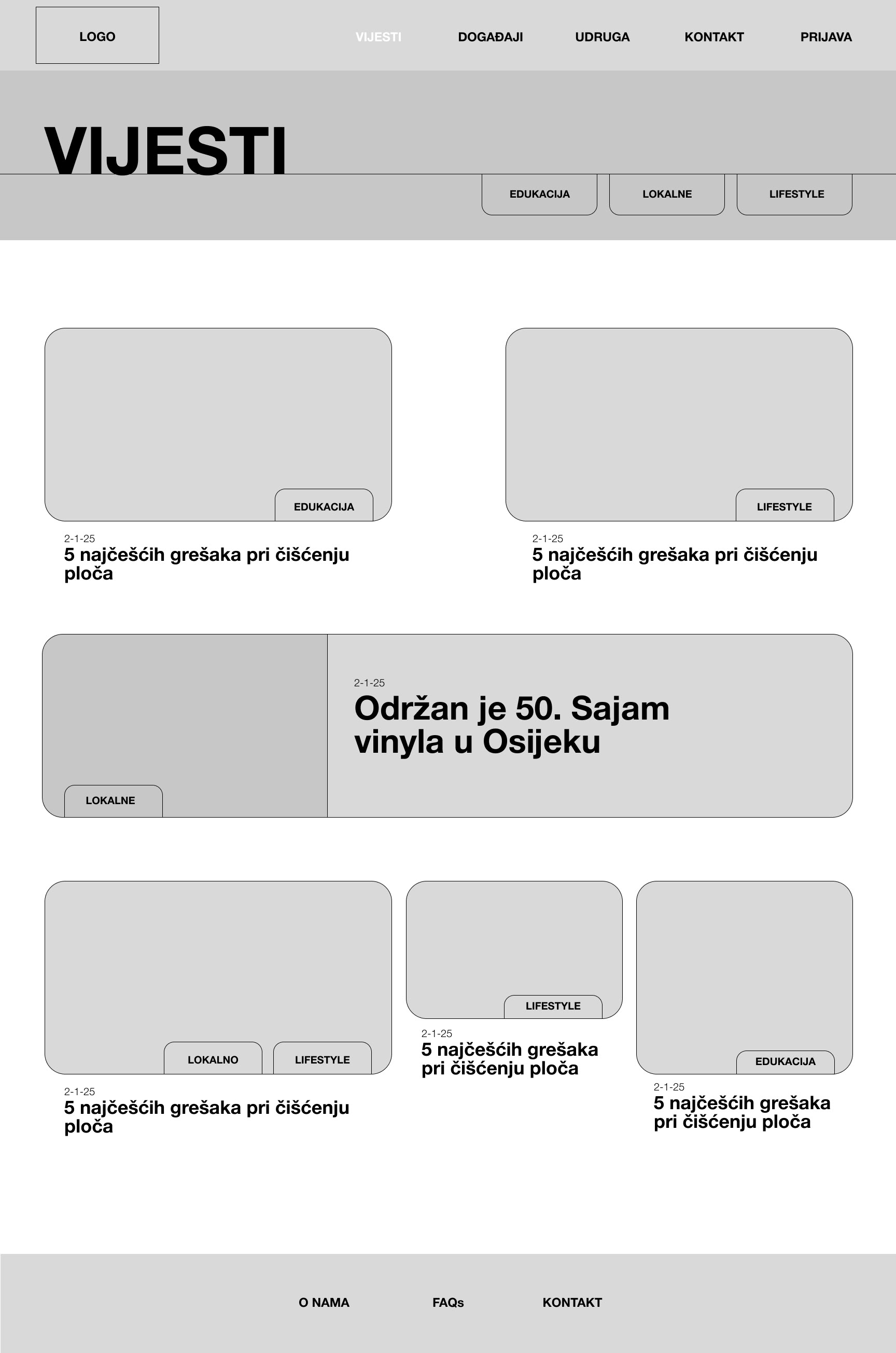
After identifying the core pain points during the wireframe testing phase, the focus shifted to defining a visual language that communicates the passion, authenticity, and communal spirit of the "Volim gramofonske ploce" association. The goal was to bridge the gap between analogue nostalgia and modern digital usability, creating a digital space that feels as tactile and authentic as a record sleeve.
The heart of this new identity is the redesigned logo. I moved away from literal or cluttered imagery toward a minimalist mark that evokes the essence of a spinning record.
This circular form represents more than just the medium; it signifies the community itself-a closed circle of enthusiasts sharing a common love for music.
Instead of a cold, high-tech aesthetic, I chose tones that evoke the warmth of vintage record labels while providing high contrast for modern accessibility. Deep vinyl blacks provide a grounded foundation, while the accent colors are used strategically to categorize content and guide the user’s eye toward key calls to action, ensuring the site feels vibrant rather than like a static archive.
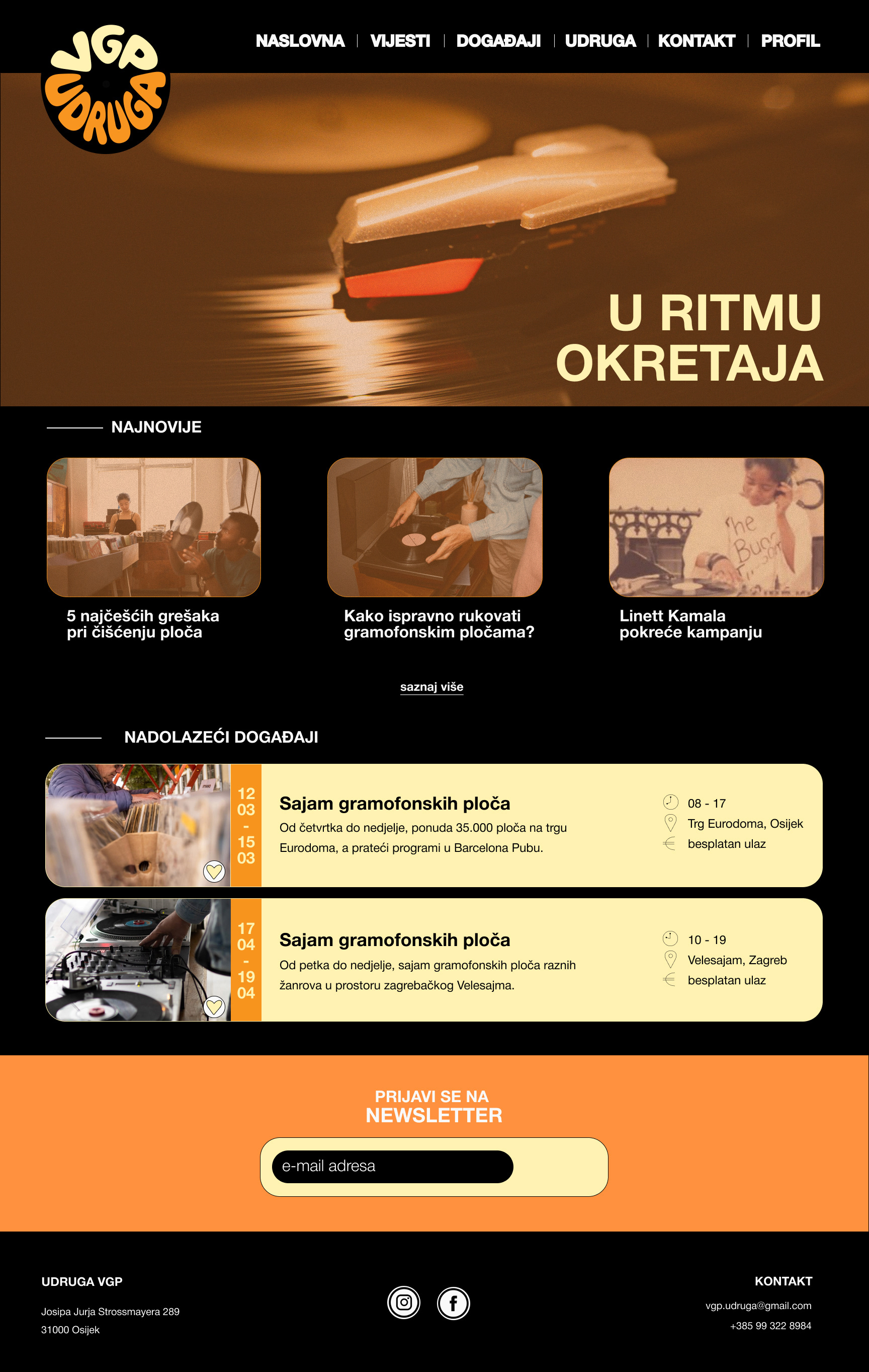
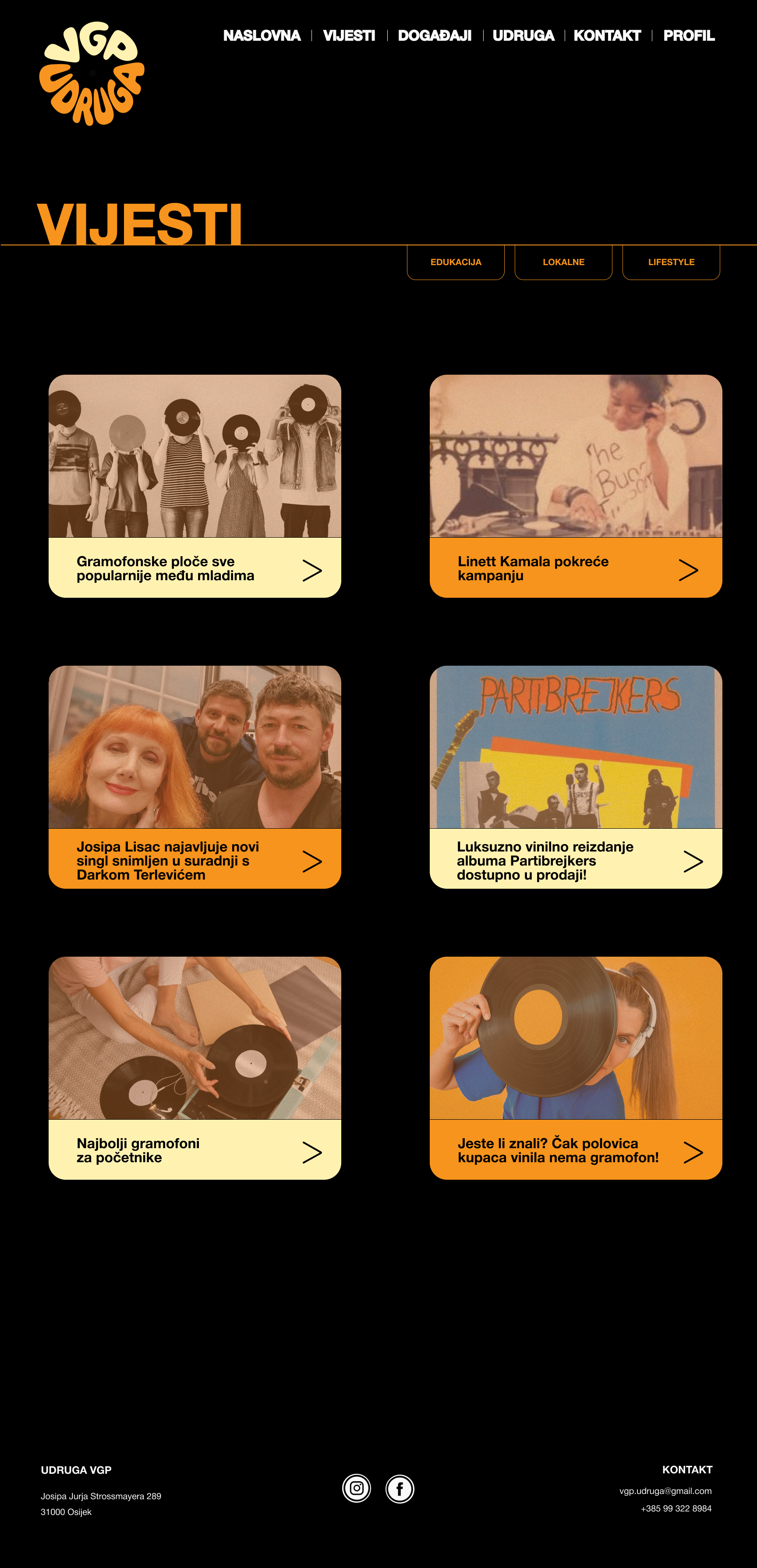
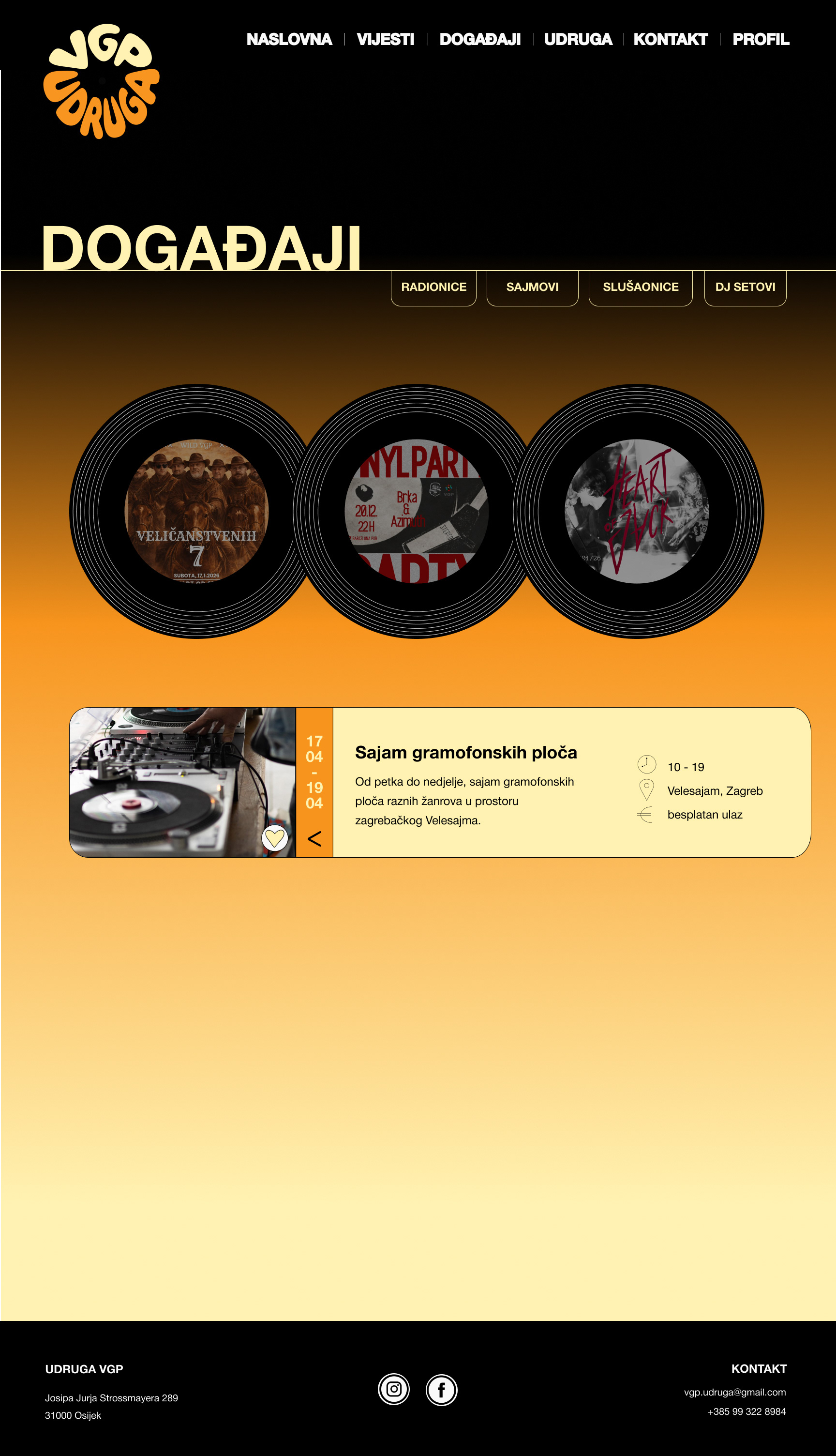
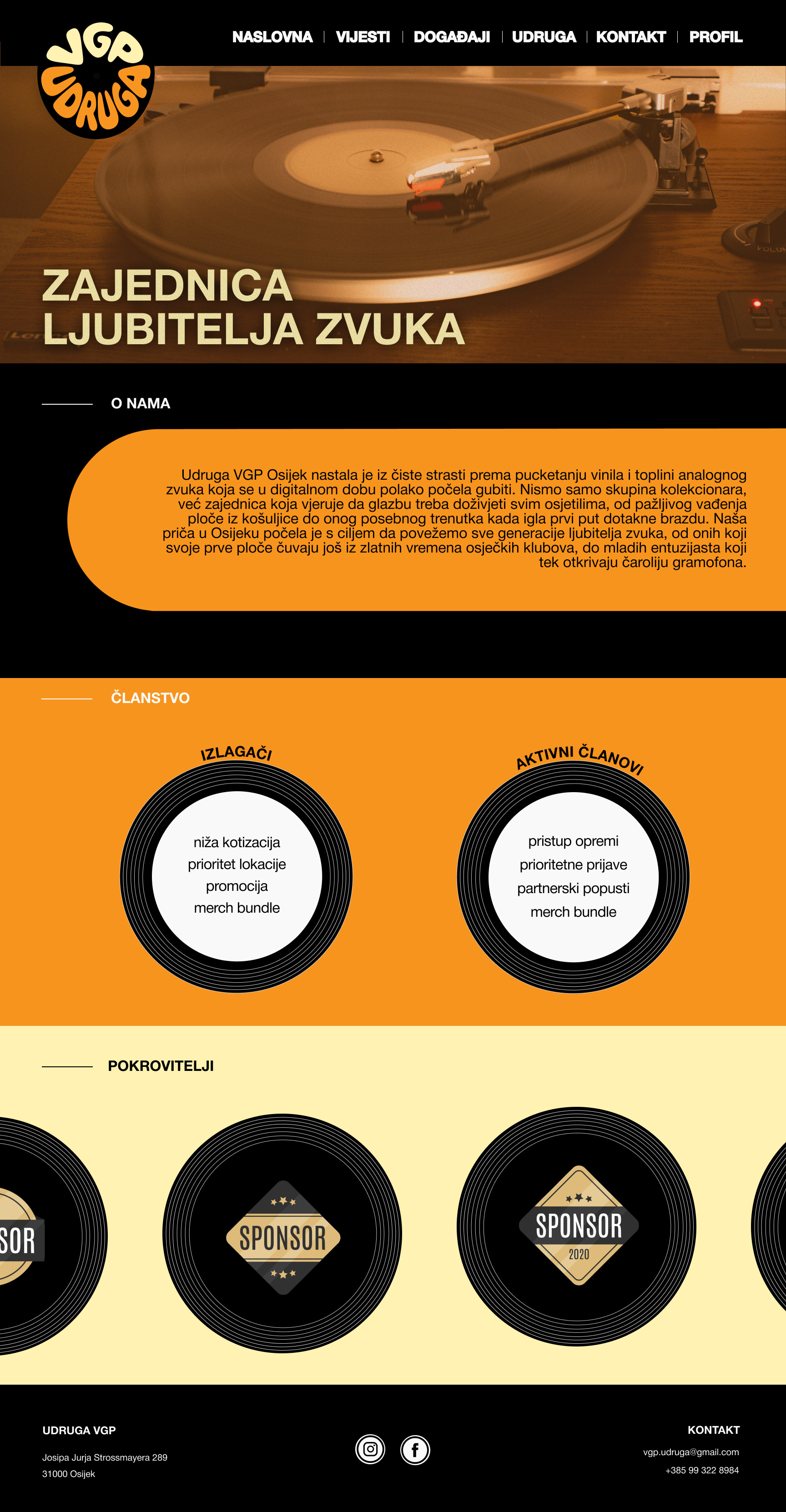
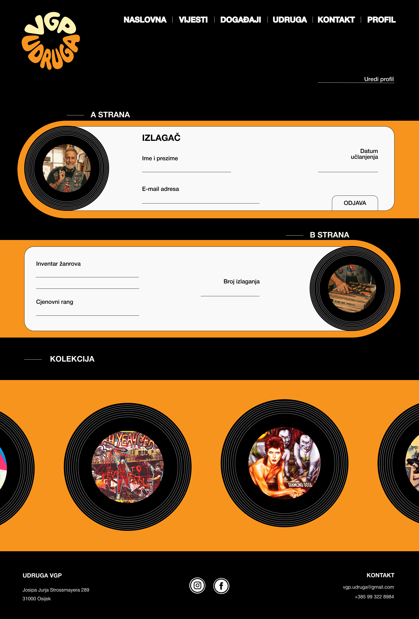
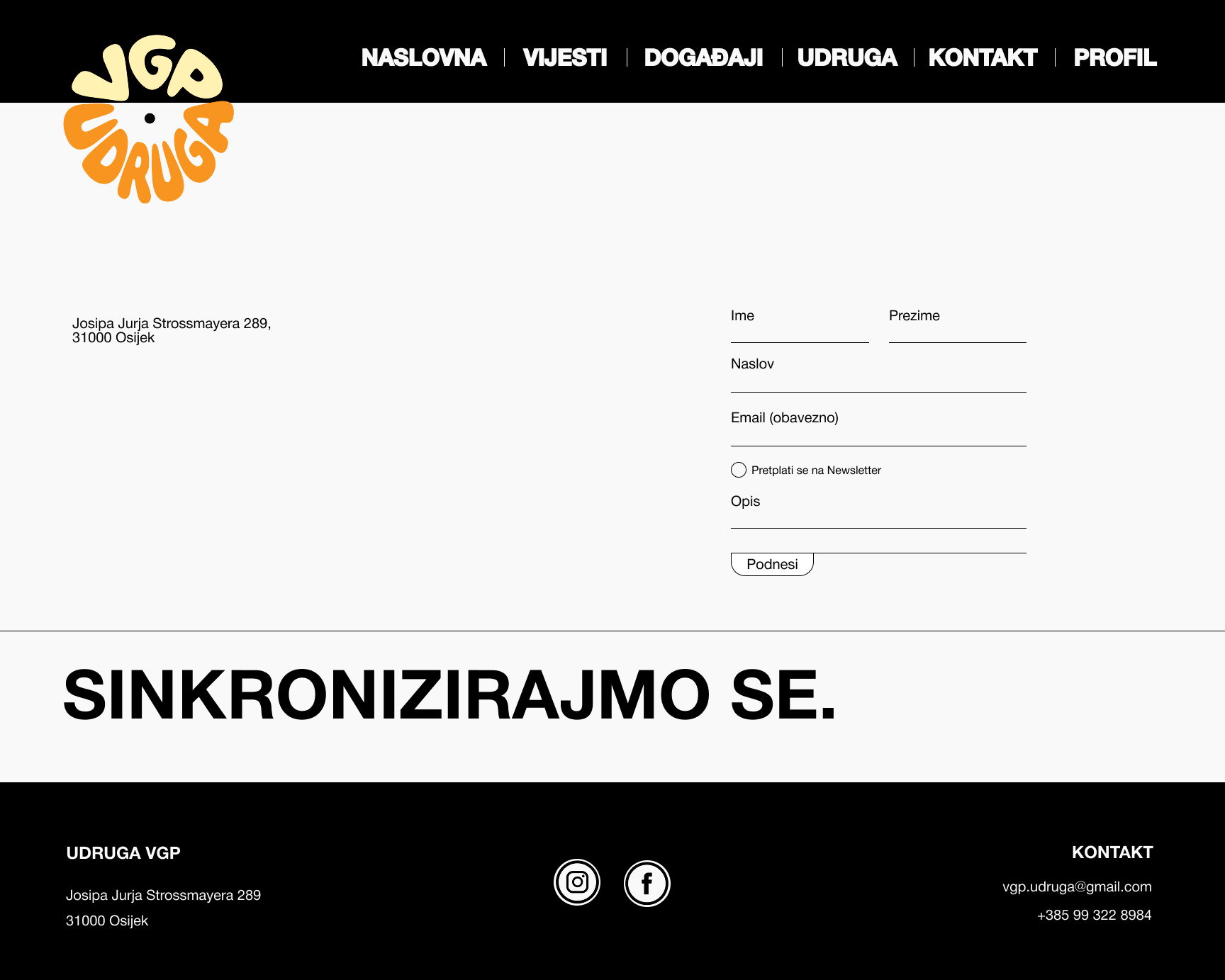
To validate these design choices and ensure a seamless journey, I developed a high-fidelity interactive prototype. This stage was crucial for testing how the new visual identity and optimized information architecture work in harmony. The following video walkthrough demonstrates the final flow of the platform, highlighting the fluid transitions and responsive elements that bring the "Volim gramofonske ploce" experience to life. It serves as the final proof of how a thoughtful design system can solve functional problems while staying true to the soul of the subject matter.
